

What Goes Into a Statement Society Design
After all the pieces were baked and finished, I had what I always have: a pile of leftover clay in every color, sitting on the worktable, too good to waste. So I played.
Every month—
A new pair lands in a Statement Society subscriber's mailbox. Handmade, chosen with intention, something they didn't pick themselves and might never have reached for on their own.
What most people don't see is what happens before the pair exists. The leftover clay on the worktable. The color combination that arrives almost by accident. The technique that gets pulled out because the moment calls for it. The point where a loose idea becomes something you hold in your hand and think — yes, that's the one.
This is what that process looked like for February.
I had spent all winter working on the Winter Mini Collection —
The first collection of the year and the first in the four-part Seasons of You series. Bold, unapologetic colors. Magenta, cobalt, royal purple, emerald, icy blue. The whole collection was built around the idea that winter doesn't have to be quiet or muted or hushed. It can be loud. It can be joyful. It can cut through the gray.
After all the pieces were baked and finished, I had what I always have: a pile of leftover clay in every color, sitting on the worktable, too good to waste.
So I played.
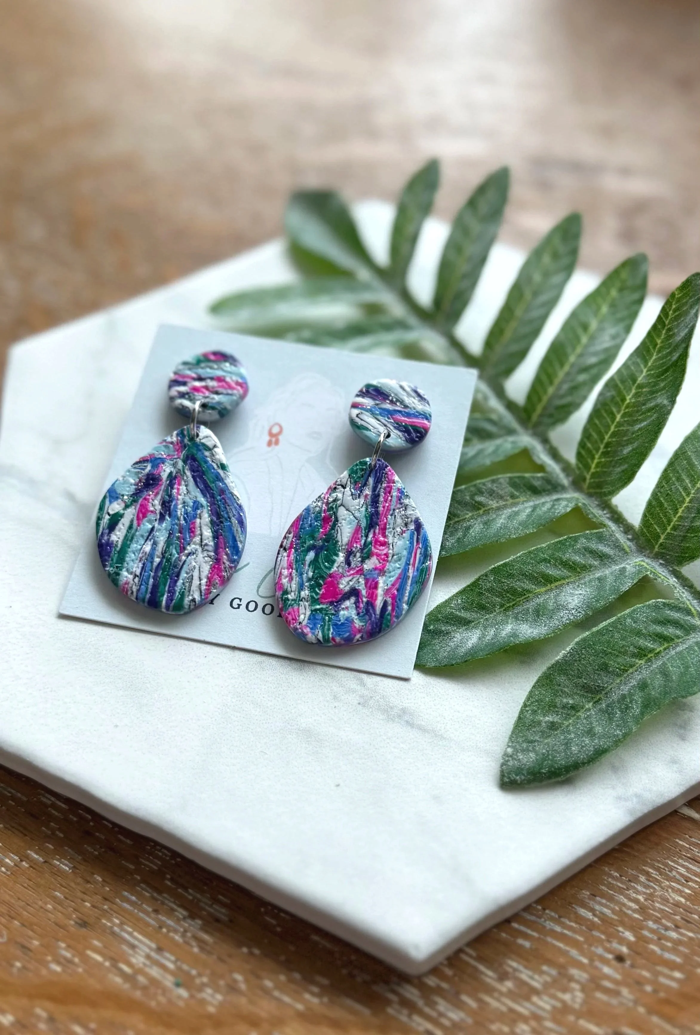
I started with the marbled black and white clay left over from the No Holding Back statement studs. That particular blend is one of my favorites to work with — it makes a beautiful faux howlite, that sharp clean stone-like pattern with fine veining running through it. I love the way it looks. I love what it does as a base.
Then I started adding the winter collection colors into the mix. Pink. Cobalt. Icy blue. Royal purple. White. Emerald. Not marbling them fully — letting them swirl and streak through the howlite base, keeping their distinctness while still becoming part of something unified. The veining from the howlite stays visible underneath, subtle but present, giving the whole thing a depth that pure color alone wouldn't have.
Then the texture. Sandpaper pressed into the surface — rough, matte, tactile. Not shiny. Not polished. The matte finish keeps the texture at the forefront, lets the eye rest on the surface rather than bouncing off a reflection. It is the kind of finish that looks even better in person than in a photo, which is saying something.
The shape came last, or rather revealed itself as I worked — a beautifully asymmetrical organic teardrop. Not a perfect oval, not a geometric drop. Something organic and a little uneven, the kind of shape that looks effortless and isn't.
The whole time I was making this pair…
I was still thinking in the language of the Winter Mini Collection. Bold. Unapologetic. Clear. The collection had given me a mindset as much as a palette, and I wanted the Statement Society piece to carry that same energy — to feel like it belonged to the same season, the same philosophy, even though it wasn't technically part of the collection.
I think it does. The colors are the winter colors. The attitude is the winter attitude. But the technique is its own thing — the faux howlite base giving it a groundedness, a stone-like quality, that the collection pieces don't have.
Here is what I love about this particular pair beyond the making of it:
It goes everywhere.
Jeans and a white t-shirt — yes. A bright pink cocktail dress — absolutely yes. A cozy sweater on a cold afternoon, a blazer for a meeting, a simple wrap dress for a dinner out. The matte texture and the organic shape keep it from being too precious, too formal, too much. It is a statement piece that doesn't demand a special occasion.
That versatility is not an accident. It is something I think about with every Statement Society design — not just whether the piece is beautiful, but whether it is wearable. Whether it will actually get worn, in real life, by a real woman moving through a real day.
This one will.